🧚CLEARFAIRY

Capturing Creative Workflows through
Decision Structuring, In-Situ Questioning, and Rationale Inference

Kihoon Son Kihoon Son KAIST
DaEun Choi DaEun Choi KAIST
Tae Soo Kim Tae Soo Kim KAIST
Young-Ho Kim Young-Ho Kim NAVER AI Lab
Sangdoo Yun Sangdoo Yun NAVER AI Lab
Juho Kim Juho Kim KAIST · SkillBench
TL;DR

Paper trailer — a short overview of CLEARFAIRY.

Overview of CLEAR and ClearFairy pipeline showing (a) In-Situ Questioning, (b) Workflow Capture System, and (c) Documentation page

Overview of CLEAR and CLEARFAIRY. CLEAR structures creative workflows into cognitive decision steps. CLEARFAIRY captures these steps through (a) In-Situ Questioning on the canvas, (b) a Workflow Capture System via Figma plugin, and (c) a Documentation page.

Capturing professionals' decision-making in creative workflows (e.g., UI/UX) is essential for reflection, collaboration, and knowledge sharing, yet existing methods often leave rationales incomplete and implicit decisions hidden. We present CLEARFAIRY, a think-aloud AI assistant for UI design that detects weak explanations, asks lightweight clarifying questions, and infers missing rationales.

83%
Strong explanations captured
(vs. 14% baseline)
85%
Inferred rationales accepted
(as-is or with revisions)
417
Cognitive decision steps
released as a dataset
12
Creative professionals
in user study (N=12)
Strong: causal reasoning with goals, alternatives, or design criteria Weak: some context but lacks the "why"

What Makes Capturing the Rationale Behind Decisions So Difficult?

Self-explanation during creative workflows faces three critical challenges:

Incomplete Rationales

Verbalized self-explanations are often "weak" — they provide insufficient reasoning without causal context, prior knowledge, or comparison of alternatives.

Disruptive Questioning

Answering clarifying questions in real time interrupts the creative flow, imposing a cognitive burden that hinders the design process.

Hidden Implicit Decisions

Verbal reports alone fail to reveal implicit decisions — those based on expert conventions, aesthetic intuition, or tacit knowledge that feel too natural to explain.

CLEAR: A New Workflow Segmentation Approach

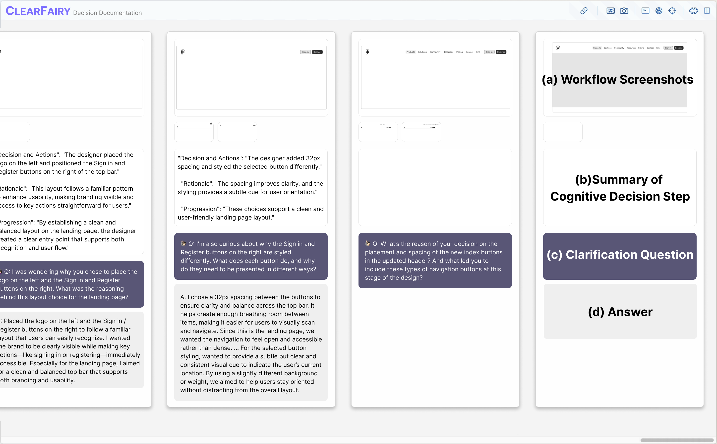
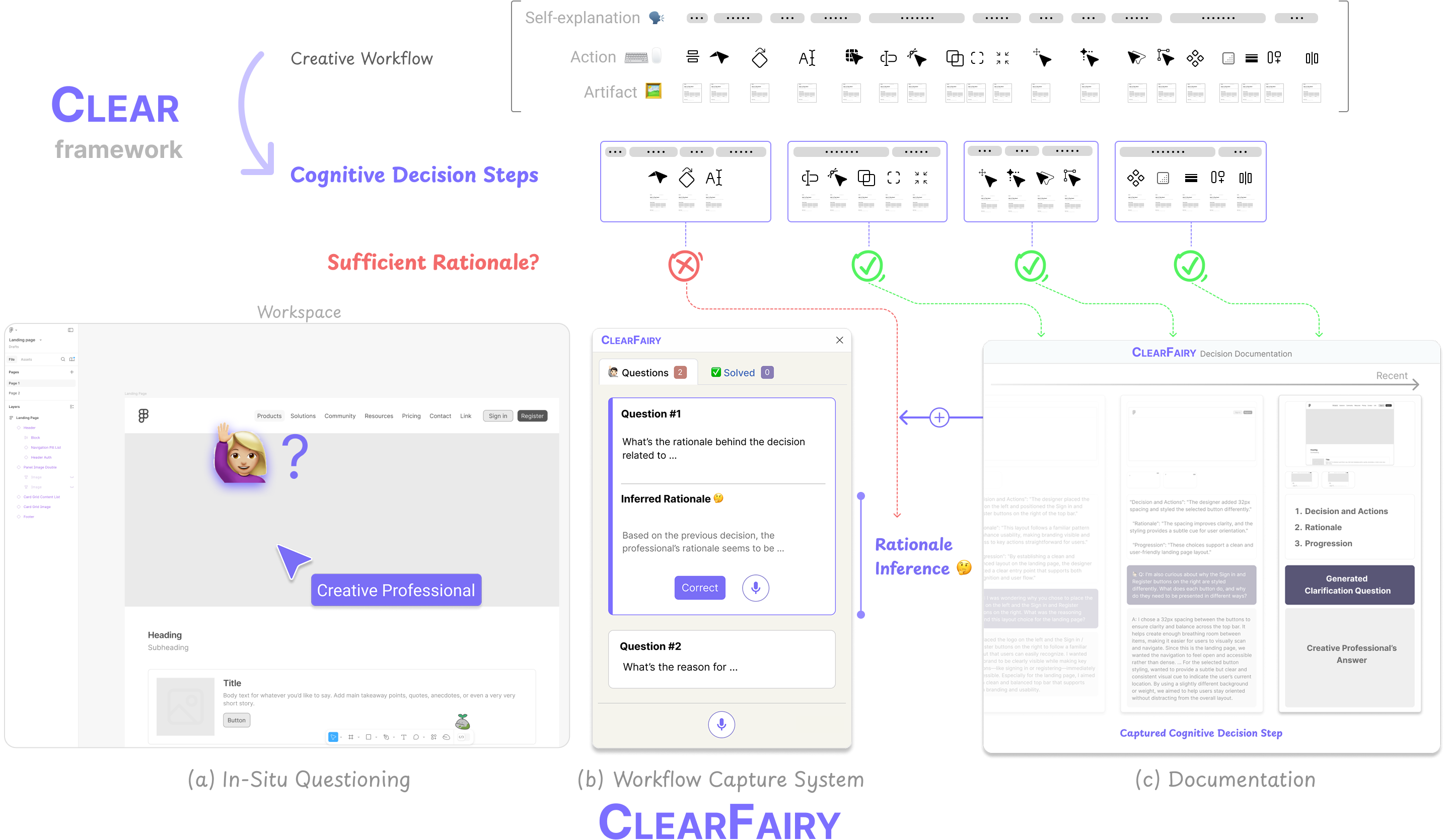
Cognitive Linking of Explanations, Actions, and Results — structuring workflows into Cognitive Decision Steps.

What is a Cognitive Decision Step?

A unit of decision-making defined by dynamic, adaptive, and contextual boundaries — comprising one or more linked explanations, actions, and artifacts.

Example

"This page title lacks visual emphasis — I'll make it bolder and increase the size to clarify hierarchy and identity."

Explanation
"…clarify hierarchy and identity"
Action
Adjust font size & weight
Artifact
Updated title in Figma

Dynamic

Decisions are structured in real-time as they occur, not retrospectively — preserving the natural flow of thought.

Adaptive

Step boundaries flex to individual differences — expertise level, working style, and task context all shape decision boundaries.

Contextual

Each decision is fully understood only through the linked combination of explanations, actions, and their resulting artifacts.

🧚CLEARFAIRY: A Think-Aloud AI Assistant

A Figma plugin that operationalizes CLEAR through a generative pipeline — capturing, evaluating, and inferring rationales without disrupting the creative workflow.

a

In-Situ Questioning

When the system detects a weak or empty explanation, it generates a targeted clarifying question and places it directly on the relevant element in the Figma canvas.

  • Questions appear as on-canvas overlays — no context switching
  • Designers can answer at opportune moments, not mid-action
  • Visual markers highlight exactly which design element is in question
In-Situ Questioning in ClearFairy — clarification question appearing on Figma canvas
Processed by
b
Rationale Inference in ClearFairy — system infers rationale based on previous decision steps

Mixed-Initiative Knowledge Capture

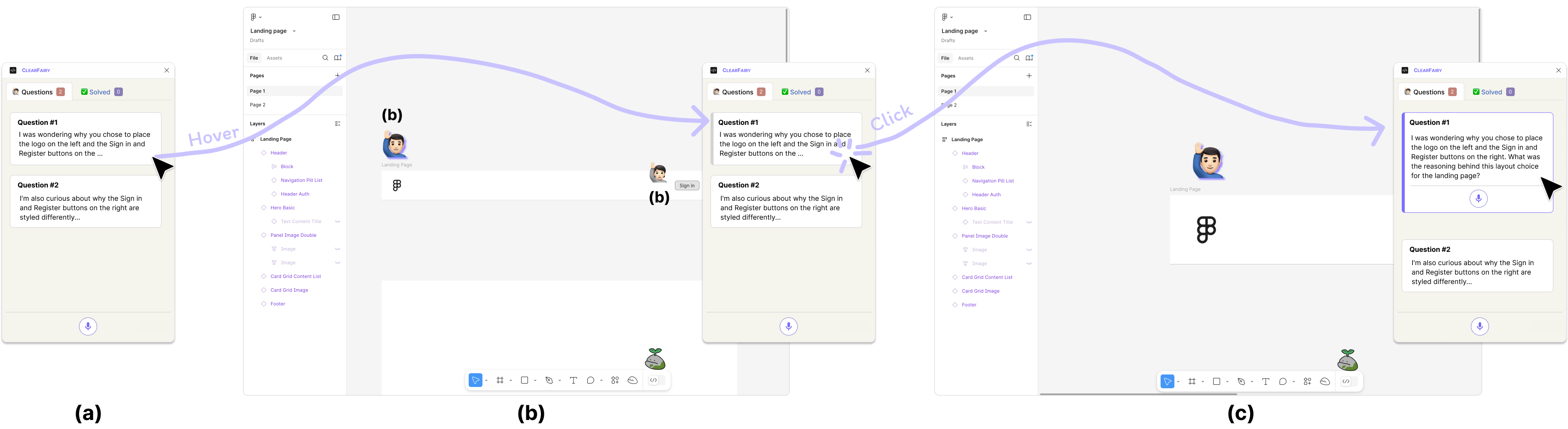
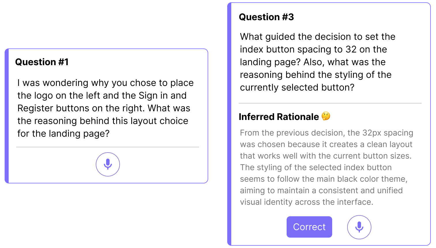
ClearFairy uses a mixed-initiative design: designers explain rationales for their early decisions, and the system infers the rest from those examples, surfacing reasoning experts rarely articulate alone.

  • Segmentation: Groups sentences and actions into decision steps via LLM
  • Rationale Evaluation: Classifies each step as Strong / Weak / Empty (80.2% accuracy)
  • Rationale Inference: Learns from past Q&As to predict missing rationales
Organized into
c

Documentation

Each captured decision step is organized into a living document containing the decision, rationale, clarification Q&A, and artifact screenshots.

  • Searchable, reusable workflow documentation
  • Useful for self-reflection, novice learning, and team collaboration
  • Forms a dataset for training AI agents
Documentation page in ClearFairy showing captured cognitive decision steps

Results: More Rationale, Less Burden

Within-subjects study with 12 UI/UX professionals comparing CLEARFAIRY to a think-aloud baseline.

Strong

Strong Explanation

Provides sufficient causal reasoning — includes goals, comparisons to alternatives, prior knowledge, or aesthetic/functional criteria for the decision.

Weak

Weak Explanation

Some context is given but the rationale is incomplete — lacks the "why" behind the decision or relies on vague, surface-level descriptions.

Empty

Empty Explanation

No rationale provided — the decision is made without any verbal justification, leaving the intent entirely implicit.

Quantitative results comparing rationale quality distribution between ClearFairy and baseline conditions

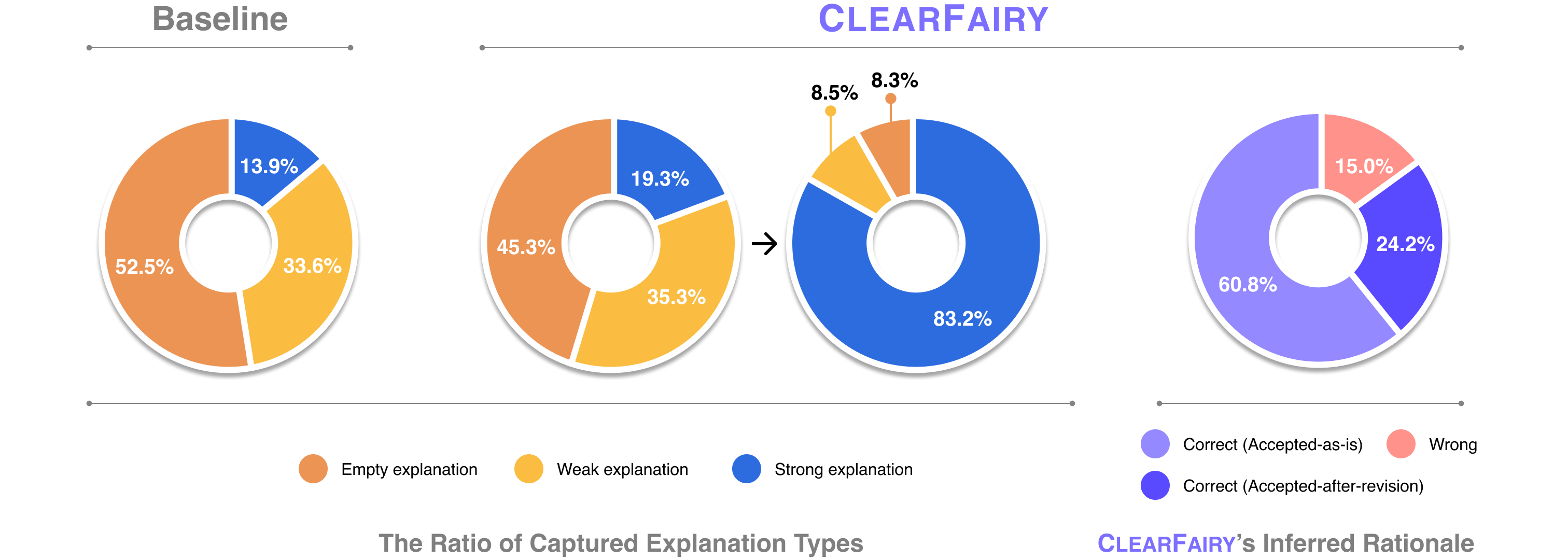
Quantitative results (N=12). CLEARFAIRY increased strong explanations from 13.9% → 83.2% while reducing empty explanations from 52.5% → 8.3%, with no significant increase in cognitive load (NASA-TLX).

85% Acceptance Rate

Of CLEARFAIRY's AI-inferred rationales were accepted by participants (as-is or with minor revisions), reflecting strong alignment with their actual reasoning.

Implicit Knowledge Surfaced

The system surfaced implicit decisions based on expert conventions, aesthetic intuition, and personal preferences that designers wouldn't have thought to explain.

No Added Cognitive Burden

No significant difference in NASA-TLX scores — despite capturing significantly more rationale, participants did not feel a higher task load.

Progressive Inference Loop

As designers provided richer explanations, subsequent AI inferences became more specific and aligned — creating a productive feedback loop.

What Can Captured Decision Steps Enable?

Beyond knowledge capture, cognitive decision steps open new possibilities for AI agents in creative workflows.

01

Next-Action Prediction

When an LLM was provided with captured cognitive decision steps with rationale, professionals preferred its predicted next actions in 66.7% of cases — vs. only 20% for the no-rationale condition.

With Rationale
66.7%
Without Rationale
13.4%
Baseline (no steps)
20%
02

AI Design Agent Alignment

A ReAct-based Figma design agent, when given style guidelines extracted from decision steps, generated artifacts that were rated as more structured, detailed, and professionally aligned — at component, section, and page levels.

Design artifacts generated by AI agent with and without captured decision steps showing differences in style and structure

Dataset: 417 Cognitive Decision Steps

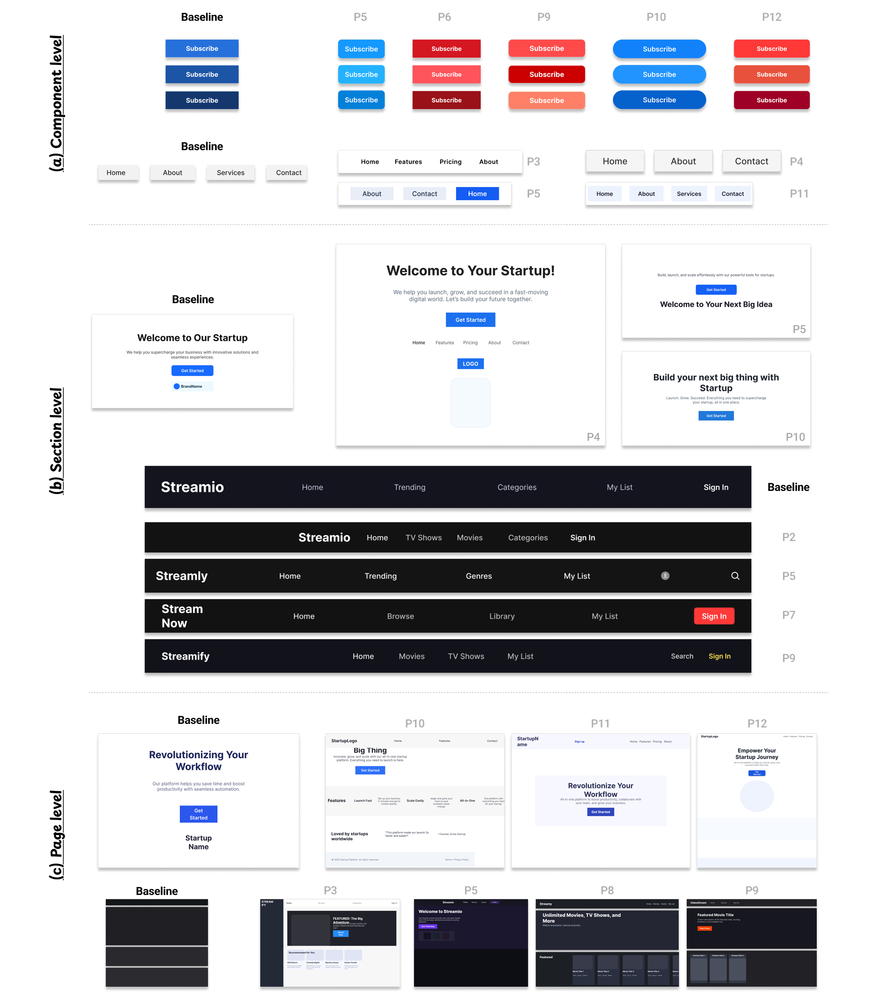
A peek at the kind of cognitive decision steps ClearFairy captures from real creative workflows.

Decision and Actions

Increased the lab title font size from 12 to 36 and placed it in the top-left corner of the frame.

Rationale

A 3× larger title dominates the visual hierarchy, while top-left placement matches natural reading flow so the lab name is the first thing visitors see.

Progression

This established the visual foundation and reference point for the rest of the page layout.

Decision and Actions

Reduced item spacing from 105 to 24, line height from 32 to 30, and letter spacing from 5% to 3% to fix overstretched text.

Rationale

The earlier values made text feel fragmented; pulling each one back into a tighter range restored visual cohesion without losing readability.

Progression

A clear pattern of iterative narrowing — overshoot, observe, dial back — until the body text felt balanced.

Decision and Actions

Set the header height to a round 80px with 40px horizontal padding and 24px icons (a multiple of 4).

Rationale

Round numbers and multiples of 4 reduce friction during alignment work and developer handoff later.

Progression

These standardized dimensions prepared the header for consistent reuse across other page variants.

Decision and Actions

Applied an 8px corner radius and a soft drop shadow (12px radius, 4px offset, low opacity) to product cards.

Rationale

An 8px radius feels modern without being cartoonish, and a subtle shadow gives just enough depth to suggest clickability.

Progression

These visual touches transformed flat product thumbnails into inviting, interactive elements.

Decision and Actions

Set up a 12-column grid with 20px gutters and 360px offset on a 1920px frame, then sized featured-product titles down from 40 to 24 (bold).

Rationale

12 columns flex evenly into 2/3/4/6 layouts; the 360px offset centers content. The 40 → 24 step (60% scale) clearly differentiates featured from primary titles.

Progression

This grid + type system became the backbone for scaling from a few featured products to a full catalog.

Decision and Actions

Switched body type to Pretendard Variable Regular and headers to Hanken Grotesk Semi-Bold, with headers at 32-35px and body at 20px (1.5 line height, ~17% letter spacing).

Rationale

Variable fonts keep file size small while supporting fine weight control. Semi-Bold conveys authority without heaviness; the spacing values fit the typeface's character.

Progression

A coherent type system replaced default fonts, making the design feel intentional throughout.

Decision and Actions

Reduced the featured product image from 240×243 to a smaller proportion and added a fourth product card; compressed inter-card spacing from 9 to 4 units.

Rationale

Distributing content across more cards improved perceived variety; a 4-unit grid kept spacing snappy and responsive-friendly.

Progression

Shifted the layout from a 2-image showcase to a denser 3-4 product grid.

Decision and Actions

Crossed out the original price and lifted the discount label (e.g., "31% off") above the product image, then compacted the long review-count phrase down to "(314)".

Rationale

The strikethrough plus elevated discount captures attention in the first 1-2 seconds of card scanning. Compacting the review count cuts visual noise without losing the signal.

Progression

Optimized the product card for fast-scan e-commerce browsing.

Decision and Actions

Set the page background to a soft light yellow (RGB 1, 0.99, 0.88) and chose Koulen 30-40px for headlines on an 8-column grid.

Rationale

A warm pastel background and a playful display font signal a young, casual brand voice — clearly off the corporate-template path.

Progression

These first-impression choices anchored the rest of the design in a non-default visual identity.

Decision and Actions

Added a heart (wishlist) icon at 22×22px with 60% opacity in the bottom-right of each product card.

Rationale

Reduced opacity and small size keep the secondary action discoverable but prevent it from competing with the product name and price.

Progression

A small placement decision that protects the primary call-to-action from visual interference.

Decision and Actions

Bumped product name size from 16 to 20px, switched from Koulen to Lexend Medium, and gave the price its own line in a thinner weight.

Rationale

A 4px size jump establishes a clean primary-secondary hierarchy between name and price; Lexend's geometry contrasts nicely with the playful Koulen header.

Progression

Created visual rhythm that guides the eye through product cards in the intended order.

Decision and Actions

Built the layout on a 12-column grid spanning 1920px with a 40px left margin, 80px header, and 285px product cards (5-6 per row, collapsing to 4).

Rationale

A 1920px frame matches standard desktop monitors; 285px cards leave just enough room for comfortable visibility, and the 5 → 4 collapse handles smaller screens.

Progression

This modular system became the constraint that scaled from a handful of featured products to the full catalog.

Decision and Actions

Replaced the cart icon with a "cart" text label (32px bold) and added a "my page" label beside it in the top-right corner.

Rationale

Text labels are unambiguous; the 32px size keeps them clickable, and the top-right position preserves familiarity from conventional e-commerce layouts.

Progression

Built a distinctive interface personality without breaking layout convention.

Decision and Actions

Enlarged the main hero image from 573×382 to 706×471 (a ~23% increase) and extended the supporting text background to 702×361.

Rationale

A 23% bump significantly boosts the hero's visual weight while keeping it inside the viewport; rebalancing the side text preserves the page's overall composition.

Progression

Reinforced the hero image as the page's primary focal element.

Decision and Actions

Switched navigation tabs from center to left alignment, reduced font from 36 → 24 → 20px (subtabs), shifted from Bold to Medium, and added 1% letter spacing.

Rationale

Cascading sizes establish nav hierarchy at a glance; Medium weight (instead of Bold) keeps the bar from feeling heavy, and 1% spacing adds breathing room without sprawl.

Progression

Refined an overwhelming navigation row into a clean, scannable menu system.

Decision and Actions

Expanded the lab introduction text box to 1251px wide, dropped font size from 36 to 15px, and reduced line height from 34 to 21px.

Rationale

At 1251px the intro spans most of a 1920px viewport, claiming prominence; the smaller body size differentiates it from the title without losing readability.

Progression

Created a substantial body block for context without competing with the headline.

Decision and Actions

Set category tabs in Noto Sans Display Regular at 24px with 39px line height (~1.6 ratio) and 1% letter spacing, centered horizontally.

Rationale

A 1.6 line-height ratio is the sweet spot for navigation readability; Noto Sans Display brings a geometric, modern feel.

Progression

Added a level of typographic refinement that signals deliberate craft.

Decision and Actions

Drew a section divider line at 899px wide with stroke weight increased from 1 to 4px.

Rationale

A 4px stroke (4× the default) creates a confident visual break between sections without becoming a heavy bar; the 899px width aligns to the content grid.

Progression

Improved visual scanning by making content boundaries unmistakable.

Decision and Actions

Shrunk research keyword boxes from 318 to 262px wide and switched the background from light gray to light blue (RGB 0.902, 0.941, 0.984).

Rationale

A 17% width cut prevents the boxes from dominating the row; the soft blue gives them a distinct identity without breaking the palette.

Progression

Turned utilitarian containers into intentional design components.

Decision and Actions

Set the header frame to 1512×100px, with 40px left padding, a 32px bold logo (left-aligned), and menu items reduced from 27 to 18-20px.

Rationale

100px (divisible by 4 and 5) scales cleanly to a responsive 80px variant; the 32 → 18-20px drop creates a clear primary/secondary nav hierarchy.

Progression

Standardized dimensions made the header reusable across multiple page variants.

Decision and Actions

Built a hamburger menu icon from three horizontal lines with a 2.5px stroke, grouped to move as one unit, in the top-left.

Rationale

A 2.5px stroke is visible at small sizes without feeling chunky; the three-line glyph is universally read as "expand menu".

Progression

Signaled collapsible navigation without needing tooltips or hover states.

Decision and Actions

Increased the member-photos background area from 237 to 630px tall, darkened its fill slightly, and added a "Member Photos" label centered at 24px.

Rationale

A 630px height (~45% of a 1400px viewport) gives the visual block real weight, leaning the page toward a magazine feel rather than a dense academic list.

Progression

Re-balanced the page from text-heavy to image-forward.

Decision and Actions

Moved the lab name to the left of the banner, bumped its font from 30 to 32px (Semi-Bold), and added a 30px introduction text 1139px wide below.

Rationale

Semi-Bold gives the title authority without aggression; matching intro size at 30px creates rhythm rather than contrast, and 1139px nearly fills the 1512px frame.

Progression

Established a strong above-the-fold communication of the lab's mission.

Decision and Actions

Set the section title "NEWS" at 32px and dialed letter spacing from 0% → 20% → 15%, expanding the text width from 96 to 111px.

Rationale

20% felt overstretched; pulling back to 15% gives breathing room while keeping the word readable as a single unit.

Progression

Another iterative refinement: overshoot, observe, settle.

Decision and Actions

Created news thumbnails at 240×180 (4:3 aspect ratio), with publication date at 20px Medium and description at 15px (constrained to 180px wide).

Rationale

4:3 matches standard photo and screen ratios so images feel native; the 5px font drop between date and description creates a clean information hierarchy.

Progression

Unified news cards into a consistent, scannable grid.

Decision and Actions

Set the page frame to 1280px with an 8-column, 20px gutter, 50px offset grid; navigation menu sized at 14px in Roboto Mono.

Rationale

1280 supports tablets and smaller laptops while remaining desktop-friendly; Roboto Mono brings a technical, lab-oriented feel.

Progression

Baseline dimensions and font choices positioned the site for responsive design and technical credibility.

Decision and Actions

Used member pictograms at 188×242px instead of real photos, with the role label below each name.

Rationale

Pictograms protect privacy while keeping the visual representation; the 188×242 ratio (≈0.78) fits portrait orientation without letterboxing.

Progression

A conscious privacy decision turned into a stylistic choice for the site.

Decision and Actions

Set the main title to 36px Hanken Grotesk Bold and the subtitle to 20px (down from 36), with 28px (down from 32) spacing between them.

Rationale

A 2:1 size ratio creates clear hierarchy; pulling the gap to 28px keeps the two elements perceptually connected as one unit.

Progression

Anchored the visual identity in a memorable, custom typographic system.

Decision and Actions

Built research-keyword boxes with a light blue background (RGB 0.902, 0.941, 0.984), 20px Medium text, 286px width, and 16px gaps.

Rationale

286px (≈1/5 of a 1400px viewport) packs 3-4 keywords per row; 16px gaps (a multiple of 4) keep spacing consistent with the rest of the system.

Progression

A modular layout that can grow with new keywords without restructuring the page.

Decision and Actions

Built a "Highlight News" card at 240×180 (4:3), with title in 20px Hanken Grotesk and description at 16px, bolding key phrases like venue names and award labels.

Rationale

Bolding key achievements lets readers scan for impact in milliseconds; the 4px size drop between title and description preserves hierarchy without large jumps.

Progression

Optimized the news card for skim-reading while preserving meaningful detail.

417 Decision Steps
12 Professionals
3 Fields per Step

Each decision step contains:

  • Decision & Actions — what was decided and the specific actions taken
  • Rationale — the "why" behind the decision (sufficient causal reasoning)
  • Progression — how this step advanced the artifact toward its next state
Download Dataset

Paper & BibTeX

ClearFairy paper thumbnail — Overview figure

CLEARFAIRY: Capturing Creative Workflows through Decision Structuring, In-Situ Questioning, and Rationale Inference

Kihoon Son, DaEun Choi, Tae Soo Kim, Young-Ho Kim, Sangdoo Yun, Juho Kim

CHI 2026 — ACM Conference on Human Factors in Computing Systems

Read on arXiv →
BibTeX
@inproceedings{son2026clearfairy,
  title     = {ClearFairy: Capturing Creative Workflows through
               Decision Structuring, In-Situ Questioning, and Rationale Inference},
  author    = {Son, Kihoon and Choi, DaEun and Kim, Tae Soo and
               Kim, Young-Ho and Yun, Sangdoo and Kim, Juho},
  booktitle = {Proceedings of the 2026 CHI Conference on Human Factors
               in Computing Systems},
  year      = {2026},
  publisher = {ACM},
  doi       = {10.1145/3772318.3791680}
}